The only measure of a successful website is its ability to engage and convert visitors. To achieve this, you must turn to critical data about your visitor’s interaction with your website, such as clicks and scrolls. This process is known as heat mapping. There are three tools currently on the market to help monitor visitor interaction on your website: Microsoft Clarity, Hotjar, and CardioLog Analytics.
This guide will look into each tool to determine how they can help with analyzing website performance through click and heat mapping.
Introduction to Click Heat Maps
Click heat maps are a visual representation of visitor activity on your website. They determine what areas of your website your visitors are engaging most with through scrolls and clicks. You can also use this technology to analyze the forms they fill out and which area of their website interaction prevented conversion.
There are different types of heat maps available, such as those for hovering, scrolling, and clicking. Each type of heat map is critical to your website performance analysis since you can make improvements to achieve your desired activity. Furthermore, they tell you which areas of your website the visitors are not engaging with (or not clicking) so you can devise ways to get them to engage more.
This tool reinforces the idea that you can use your current website performance and visitor interaction to determine their website experience. You can then use it for conducting A/B testing on your website to create higher conversions.
Related Topics:
- Tips for Interpreting a Click Map Report
- Boosting Success Through User Adoption Tracking
- Augmented Analytics Heat Map

Microsoft Clarity vs Hotjar vs Cardiolog Analytics
Now that you understand the importance of click heat maps to optimize your website performance, the next step is to find the best tool to gather this data. Currently, there are three top options: Microsoft Clarity, Hotjar, and CardioLog Analytics.
Let’s examine each of these tools separately so you can determine the best tool to use for your website.

Microsoft Clarity
Microsoft Clarity is a free tool for analyzing user behavior on your website, which is also known as heat mapping. Heatmaps are the leading feature of this tool and tell you exactly what your users want in your website.
At a glance, you will be able to see, using a visual map, what parts of your website readers engage with the most. The click heat maps tell you the elements on your page that have a high engagement level. The scroll heat maps tell you how far into your website your users have scrolled. Meanwhile, the area heat maps identify the total clicks for every part of your website.
Aside from the instant heat maps, you can also gain access to easy-to-use metrics such as a list of the top-ranked page elements. This will enable you to explore each page element and focus on ways that you can improve on them. It is a reliable tool for tracking the user journey on your website.
Hotjar
Hotjar is a heat mapping tool that helps you understand how people use your website. Just like Microsoft Clarity, there is a free account, but you can opt for other paid account types to have access to more features.
No need to guess where users click or what elements of your website work. This tool will tell you exactly what you need to know so you can make the necessary improvements where it matters most. You will also be able to identify issues with your website that you might not even realize exist. Even the best website QA won’t be able to tell you everything that is wrong with your website.
Now, you can make better use of your time and resources. This heat map tool is easy to use and comes with all the essential features you need to improve website performance.
Cardiolog Analytics
CardioLog Analytics is one of the best tools available for heat mapping. To this day, gathering insights about website performance remains a challenge for business website owners. CardioLog Analytics aims to overcome this challenge with the use of augmented technology. This tool identifies problematic areas on your Sharepoint page to make it easy to address them. The best part is that you will be provided a visualized presentation of the data to make it easier to analyze and take action.
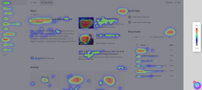
The Click Map feature is the primary tool available through CardioLog Analytics. This tool will show you the specific content on your page that visitors frequently click on. Not only are you getting data on the number of clicks, but also the flow of clicks. This data will help you track the activity of users on your website that leads to a click or conversion.
The Heat Map is another useful tool with CardioLog Analytics that aggregates the mouse activity for every visitor. You can use this data to show which content gets the most engagement from your visitors. This data will tell you the relevancy of the content and how you can produce the same type of content in the future.
Next up on the list of essential features is the Scroll Map. This tool will help you understand how each of the page elements performs with the scrolling activity on the page. If there are any specific page elements that you want more exposure to, you can re-evaluate that based on user scroll activity and pattern.
CardioLog Analytics is a superior tool for heat and clicks mapping on your website because the analytics is AI-driven. This tool will present you with the data that matters most and actionable insights that achieve your website goals. The automated process not only delivers accurate data reporting with speed, but you can also minimize errors. This AI-driven tool will give you more confidence about the efficiency of the data which is crucial in the decision-making process of implementing key website changes.
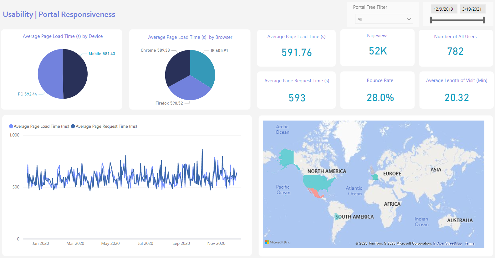
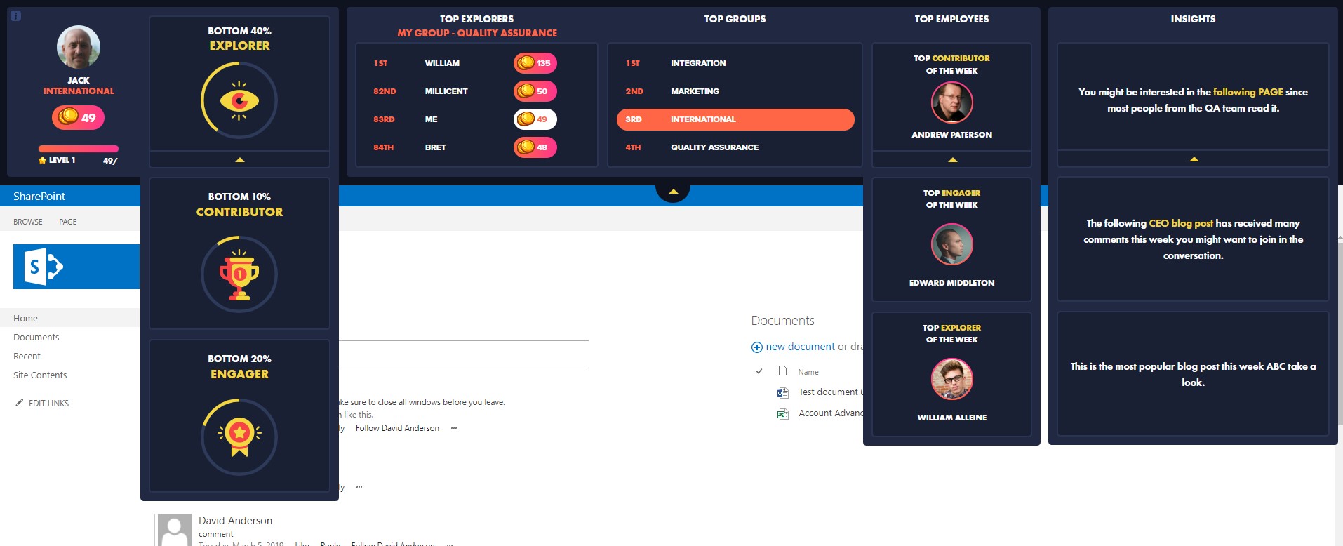
Augmented analytics built into this tool provide meaningful insights that make it easy to implement your desired changes. There are certain recommendations available for data presented so you know how to improve results. Each page is also rated with a score to motivate site owners to improve and gives you a quantitative way of measuring site performance.
Final Thoughts
Each of these tools presents unique advantages when performing data analysis and conducting website improvements. It’s also important to understand your unique business needs to match the tool’s features with your desired results. Whichever tool you choose, make the most of the features available.
FAQs about Microsoft Clarity vs Hotjar vs CardioLog Analytics
Is Hotjar better than Clarity?
The answer depends on your specific needs. Microsoft Clarity is completely free and integrates seamlessly with other Microsoft products, making it an attractive option for those already in the Microsoft ecosystem. Hotjar, on the other hand, offers a broader range of features, such as user surveys and conversion funnels, but you’ll need to pay for access to its more advanced features.
What are the biggest differences between Hotjar and Microsoft Clarity?
One of the key distinctions lies in pricing and features. Microsoft Clarity is entirely free, providing unlimited session recordings and heatmaps, though the data retention period is limited unless you tag specific recordings. Hotjar offers a free plan with limited features but requires a subscription for more advanced functionalities like detailed form analysis and segmenting data by date.
What is the main advantage of CardioLog Analytics?
CardioLog Analytics stands out for its AI-driven insights and its ability to provide comprehensive heat mapping, specially tailored for SharePoint environments. It not only tracks user interactions but also delivers actionable recommendations based on that data, making it an invaluable tool for optimizing complex websites.
What is the disadvantage of Hotjar?
While Hotjar offers a robust set of features, it does have some limitations. For instance, it lacks in-depth form analysis and doesn’t allow you to split data by specific date ranges, which can be crucial for detailed user behavior analysis. For those needing more granular insights, other tools might be necessary.
How can you use Microsoft Clarity effectively?
To maximize the benefits of Microsoft Clarity, focus on analyzing heatmaps and session recordings to understand user behavior on your site. By identifying which elements users engage with most, you can prioritize those areas for improvement. Additionally, take advantage of Clarity’s integration with other Microsoft tools to streamline your workflow and enhance data analysis.
Is Microsoft Clarity completely free?
Yes, as of now, Microsoft Clarity is entirely free with no premium tiers. However, it’s important to note that Microsoft reserves the right to introduce fees for features that are currently free, as stated in their terms of service.
How does CardioLog Analytics stand out among these tools?
CardioLog Analytics provides enterprise-level insights designed specifically for SharePoint and Microsoft 365 environments. It goes beyond basic heatmaps by delivering actionable, AI-driven recommendations to optimize user engagement and productivity within complex intranet systems.
➡️ Learn more about CardioLog Analytics and its capabilities.
Can Microsoft Clarity track user frustrations?
Yes, Microsoft Clarity includes a feature called “rage clicks,” which identifies instances where users repeatedly click on an element out of frustration. These insights help businesses pinpoint usability issues that may hinder user experience and engagement.
➡️ Check out Microsoft’s official Clarity documentation.
How can Hotjar help optimize website performance?
Hotjar offers heatmaps, session recordings, and feedback tools that highlight areas of high engagement and conversion drop-offs. These tools allow businesses to make targeted improvements, ensuring that websites perform efficiently and meet user expectations.
➡️ Explore more about Hotjar’s features.
What kind of businesses benefit most from using CardioLog Analytics?
CardioLog Analytics is best suited for large enterprises that rely heavily on SharePoint and Microsoft 365. It’s particularly valuable for companies looking for in-depth, actionable insights to improve user adoption, collaboration, and productivity across their digital workplace.
➡️ Discover how CardioLog Analytics can help your enterprise.
Can Microsoft Clarity and Google Analytics be used together?
Yes, Microsoft Clarity and Google Analytics complement each other well. Google Analytics tracks traffic sources, user demographics, and key performance metrics, while Clarity provides behavior-based insights, such as scroll depth, heatmaps, and user interaction patterns. Using both tools offers a holistic view of your website’s performance and user experience.
➡️ Learn more about Google Analytics
How does heat mapping improve user engagement?
Heatmaps visually represent user activity on a webpage, showing which areas receive the most clicks, scrolls, and attention. By understanding which parts of your site users interact with the most (or least), businesses can adjust content placement and design to improve engagement and streamline the user experience.
Why is session replay valuable for website optimization?
Session replay allows businesses to view real user interactions, revealing navigation paths, errors, and drop-off points. This detailed view helps businesses identify and resolve usability issues, improving the overall customer journey and website efficiency.
How can businesses use Microsoft Clarity to improve conversion rates?
By analyzing user behavior through Clarity’s heatmaps and session recordings, businesses can identify problem areas that may cause users to abandon the site. Adjustments like optimizing call-to-action placements, simplifying navigation, and improving forms can directly increase conversion rates.











 Follow @cardiolog