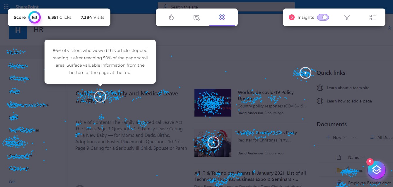
Click Maps are great reports to use so you can easily visualize traffic, conversion, and success metrics within the pages of your SharePoint portal. It’s important to understand exactly what these metrics are telling you, otherwise, your efforts to create click maps may become futile. Here are a few tips for understanding how to create and interpret a click map from start to finish:
What is a Click Map?
A Click Map is a report that can be created to show how individuals click on links within individual pages of the SharePoint portal. These metrics are overlaid on top of the page’s links to answer critical questions.

A Few Questions You May Want to Consider Asking Yourself…
- Which links are most valuable to users as they navigate through the SharePoint portal?
- What locations on the page are bringing the most and least amount of traffic?
- Which links are the least relevant to visitors, or perhaps aren’t even being accessed at all?

Why Create a Click-Map Report for SharePoint and Office 365?
By creating a clip map, you can track your user activity to improve the design of your SharePoint pages, as well as gain a greater understanding of your users’ portal preferences and experiences. You can attain the unique ability to zero in on which elements of the pages are successful, and which elements are not gaining much attention. A click map gives you intelligible insights so you can discover the obstacles that exist within your site. By understanding these obstacles, you can then determine which links and images aren’t getting enough clicks, and which call-to-action buttons are being ignored. If you notice a certain location on the page is drawing attention to the user’s eye, place your buttons there!
Once you have created a click map report to assess your SharePoint pages’ hyperlink levels, you can then easily use A/B testing to increase your adoption rates. A/B testing allows you to uncover how subtle design changes in various versions can improve your visitors’ interactions, and ultimately increase your portal adoption. You will be amazed to discover how minute changes can dramatically improve how your users interact with the portal.
How to Interpret a Click Map
- Look for areas of high activity: Areas of the page where there are a lot of clicks are likely important to users. These areas may contain important information or elements that users want to interact with.
- Identify areas of low activity: If there are areas of the page that receive few clicks, it may indicate that these areas are not as important to users or that they are not easily noticeable.
- Consider the context: The click map should be interpreted in the context of the website’s goals and the user’s needs. For example, if the goal of the website or platform is to sell products, a high number of clicks on the “add to cart” button would be expected and important.
- Compare click maps over time: Comparing click maps from different time periods can help identify trends and changes in user behavior. This can be especially useful for identifying areas of the page that may have become more or less important to users over time.
- Use click maps in conjunction with other analytics tools: Click maps can be a valuable tool, but they should be used in conjunction with other analytics tools, such as heat maps, to get a more complete picture of how users interact with a site or page.
For a comprehensive understanding of user behavior and engagement, We invite you to explore the capabilities of CardioLog Augmented Analytics by CardioLog Analytics, which can significantly drive productivity across SharePoint with the use of heatmaps.
Related Topics:
- Sharepoint Click Map
- Microsoft Clarity vs Hotjar vs CardioLog Analytics: Which Tool is the Best for Click and Heat Mapping?
- CardioLog Analytics Click-Map


 Follow @cardiolog